The View from 30,000 FOMs
Semiconductor fabs are complicated and as a result FabGuard IPMs generate a lot of data. Much of it is available in FabGuard Executive and can be displayed in FabGuard Web. What each of us wants to see is exactly the data that is meaningful to us and that we need to act on.
FabGuard Web uses the Tool Overview and Group Overview tabs to show us charts and tables that attempt to make it clear which tools and chambers need attention. This article describes the contents of the Overview tabs in FabGuard versions 8.5.8 and higher.
The Overviews
Tool Overviews charts show what the chambers are doing. Group Overview rolls that information up to the tool level for the tools in the current group.
The purpose of each chart is to highlight, using color and size, the relative performance and excursion rates of individual chambers and tools so that it's easy to spot problems.
Tool Overview
The Tool Overview tab is arranged like this:
- Row 1: Bullseyes showing current Health and Maintenance Status of each chamber.
- Row 2: Speedometers showing rates of Throughput, Utilization, Faults, and Coverage over the last 24 hours.
- Row 3: Bar charts showing the 10 most frequent alarms on the tool and the utilization history of each chamber over the last 24 hours.
- Row 4: A table showing the current activity of each chamber along with counts of alarms and maintenance events since they were last reset.
A sample Tool Overview tab is shown in Figure 1.
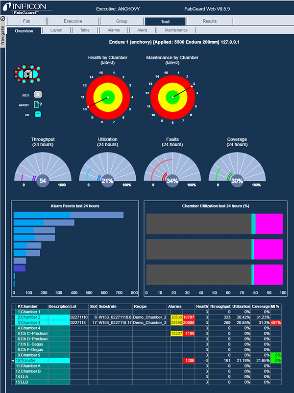
Figure 1: Example of the Tool Overview tab of FabGuard Web.
Health by Chamber – Where are the analysis errors?
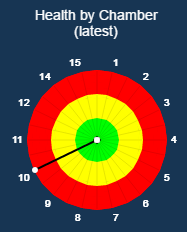
Figure 2: A bullseye chart showing a health metric that is out of control.
This bullseye chart, Figure 2, shows for each chamber, the worst distance from target among all Figures of Merit for the last measured substrate. Chambers whose last substrate had perfect health live at the center of the bullseye, which is green. The center is just a bunch of perfect health dots on top of each other. A spoke sticking out into the green, yellow, or red region represents a health metric that has deviated from the center line and/or whose analyses have resulted in faults.
Health metrics are calculated on FabGuard IPMs and sent to FabGuard Executive to create the health bullseye charts in FabGuard Web.
Health metrics have values falling within three ranges, green, yellow, and red. Perfect health (on the center line) has a radius of zero and is represented by a dot in the center of the green zone of the plot. When the health begins to deviate from the centerline, the spoke will grow in length in proportion to how close it is to the moderate or critical level. If the health exceeds a moderate or critical level, the spoke will enter the yellow or red zone respectively, Table 1.
| Health Spoke | Meaning |
|---|---|
| 0 (center) | Health is on the center line |
| 0 < R <= 1 (green) | Within limits, no moderate faults |
| 1 < R <= 2 (yellow) | Failed limits, no moderate faults |
| R = 2 (yellow/red border) | Moderate faults, no critical fault |
| 2 < R < 3 (red) | Failed limits, no critical faults |
| R = 3 (red border) | Critical faults |
Table 1: Health metric and corresponding spoke placement on the bullseye chart.
Drilling up or down from Health by Chamber

Figure 3: Health bullseye pop up menu.
If you click the dot at the end of a health bullseye spoke, you get this popup menu in Figure 3.
Clicking the left side produces a Health Summary Report showing all of the health metric measurements for the selected chamber over the last 24 hours.
Clicking the right side executes an FOM Health Summary Report that shows distance to target for each of the FOMs that contributed to the health calculation for the most recent substrate on the selected chamber.
Maintenance by Chamber – How close are we to PM?
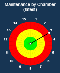
Figure 4: Bullseye chart showing chamber 3 or one of its sensors needs a PM.
The bullseye in Figure 4 shows for each chamber, the worst (highest) Maintenance Fraction for the chamber and its sensors. In this example, chamber 3 or one or more of its sensors needs a PM.
Triggers on time, filament age, and other factors generate Maintenance Indicators (MI) in FabGuard IPM on individual chambers and sensors. Reports compare these MIs against specified warning and limit values. Each chamber and sensor has a current maintenance color and fraction, Table 2.
| Color | Meaning | Fraction (distance to next level) |
|---|---|---|
| Green | Below warning | MI / warning |
| Yellow | Between warning and limit | (MI - warning) / (limit - warning) |
| Red | Above limit | MI / limit |
Table 2: MI colors and fractions for spoke placement on the bullseye chart.
Drilling down from Maintenance by Chamber
Clicking any of the chamber spokes in the Maintenance bullseye switches to the Tool Maintenance tab so you can see the individual MIs that contributed to the calculation.
Throughput (24 hours) - How much are we producing?
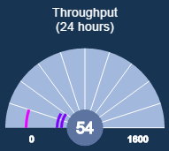
Figure 5: Throughput speedometer chart.
Throughput for a chamber is simply the number of substrates that the chamber has processed in the last 24 hours. The speedometer in Figure 5 contains an arc for each chamber. The arc's length is a percentage of the maximum throughput of all chambers on the tool. The arc for the chamber that is currently selected in the table at the bottom of the page has a lighter color. Hovering over an arc displays the chamber number and the number of processes in the last 24 hours. The number in the center of the speedometer (54 in this example) is the average throughput among all chambers on the tool.
[Figure 5]
Utilization (24 hours) - How busy is the equipment?
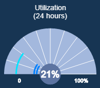
Figure 6: Utilization speedometer chart.
A chamber's utilization is the percentage of the time that it is processing substrates. To see the full breakdown of processing time vs time spent in other states (such as Stopped and Waiting), click the Chamber Utilization bar chart in the next row of the Tool Overview tab. The arc for the currently selected chamber has a lighter color, Figure 6. Hovering over an arc displays the chamber number and utilization percent. The number in the center of the speedometer is the average utilization for the tool. [Figure 6]
Faults (24 hours) - How worried should we be?
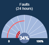
Figure 7: Faults speedometer chart.
The speedometer in Figure 7 shows the percentage of each chamber's processes that caused critical faults. The number in the center is the average fault percentage for the tool. [Figure 7]
Coverage (24 hours) - How careful are we being?
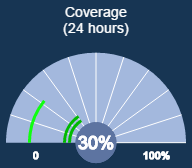
Figure 8: Coverage speedometer chart.
This speedometer shows the percentage of each Chamber's processes that had analyses applied to them in the last 24 hours. The number in the center is the average coverage for the tool.
[Figure 8]
Alarm Pareto (24 hours) - What is the FabGuard IPM warning us about?
This bar chart, Figure 1, like the Chamber Utilization chart to its right, is a compact version of a more detailed chart that expands when you click it. Alarm Pareto shows the ten most frequent alarms that occurred on the FabGuard IPM in the last 24 hours. Each bar represents an alarm type and is segmented into a different color for each of the chambers that produced this type of alarm. The expanded Alarm Pareto chart displays alarm type and chamber number when you hover over a segment. Above the expanded chart is a link labeled "Interactive Report" that opens Client to view the same chart with more detailed information.
Chamber Utilization (24 hours) - What is the equipment doing?
This bar chart, Figure 1, expands on the Utilization speedometer at the top of the page by showing the percentage over the last 24 hours that each chamber has spent in each state: Stopped, Waiting, Processing, Qualification, and Unknown. States are represented by distinct colors and there is a color legend on the expanded chart. The table at the bottom of Tool Overview uses the color representing each chamber's current state as the background color for the first three columns of the chamber row.
Group Overview
Group Overview shows some of the same information as Tool Overview but, instead of chamber by chamber, displays it tool by tool for all tools in the selected group.
Health by Tool shows one spoke per tool. A tool's health is the worst health among the tool's chambers. The purpose is to see at a glance which tools are producing the worst results.
Maintenance by Tool shows one spoke per tool. A tool's maintenance is the average of maintenance over the tool's chambers. This chart shows which tools are most in need of PM.
Throughput (24 hours) for a tool is the average of Throughput among the tool's chambers.
Utilization (24 hours) for a tool is the average of Utilization among the tool's chambers. This chart shows which tools are underutilized.
Faults (24 hours) shows the percentage of processes with critical faults for each tool in the group.
Coverage (24 hours) shows the average coverage among each tool's chambers.
Summary
The Tool Overview and Group Overview tabs of FabGuard Web graphically highlight which tools and chambers need attention in a complex and data rich factory environment.